Create Harmony and Impact with Expert Colour Theory Tips
Exploring Different Colour Schemes
Exploring different colour schemes can help artists achieve visually appealing and harmonious compositions that captivate viewers. Today we will delve into the basics of colour theory and how to apply it effectively in mural painting.
Understanding Colour Schemes
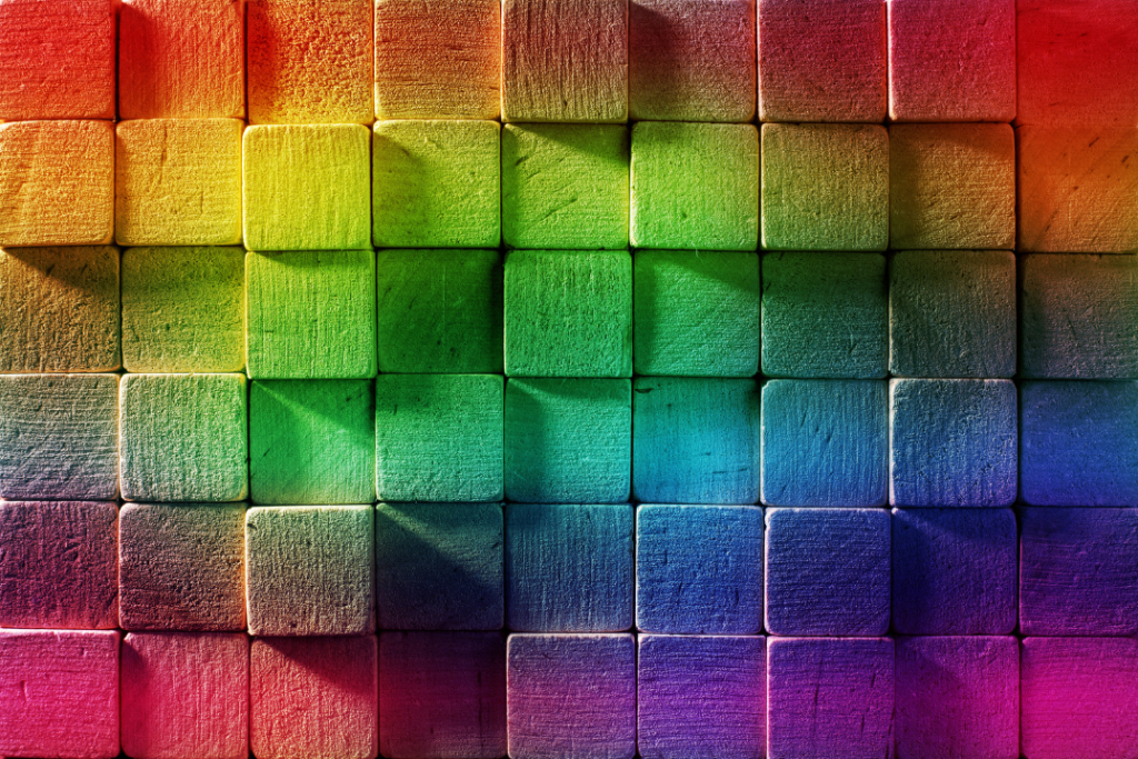
A colour scheme is a planned combination of colours used in art and design. It helps create visual interest, harmony, and balance in a composition. For mural artists, choosing the right colour scheme is crucial because it can significantly impact the mood and message of the artwork. The colour wheel is an essential tool in understanding and selecting colour schemes. It shows the relationships between primary, secondary, and tertiary colours, making it easier to create harmonious combinations.
Types of Colour Schemes
1. Monochromatic Colour Scheme
A monochromatic colour scheme uses different shades, tints, and tones of a single colour. This scheme is simple but powerful, creating a cohesive and calming effect.
Example: Imagine a mural in a serene park setting. Using varying shades of green can evoke a sense of tranquility and unity with nature. This approach ensures the mural feels harmonious and easy on the eyes.
2. Analogous Colour Scheme
Analogous colour schemes use colours that are next to each other on the colour wheel. This scheme creates a serene and comfortable design, often found in nature.
Example: Consider a mural depicting a sunset. Using red, orange, and yellow can mimic the natural progression of colours in the sky, creating a warm and inviting atmosphere.
3. Complementary Colour Scheme
Complementary colours are opposite each other on the colour wheel. This scheme offers high contrast and vibrant look, making elements stand out.
Example: Think of a mural in an urban setting where you want certain elements to pop. Using blue and orange can create striking contrasts, making key parts of the mural more noticeable and engaging.
4. Triadic Colour Scheme
A triadic colour scheme uses three colours that are evenly spaced around the colour wheel. This scheme provides a balanced and vibrant composition.
Example: For a playful and energetic mural in a children’s playground, you could use red, yellow, and blue. These primary colours are balanced yet lively, attracting the attention of children and creating a fun environment.
5. Split-Complementary Colour Scheme
Split-complementary schemes involve one base colour and two secondary colours adjacent to its complementary colour. This scheme offers the contrast of complementary colours without the tension.
Example: In a mural for a seaside café, using blue with yellow-orange and red-orange can provide a fresh, dynamic look that complements the coastal theme without being overwhelming.
Practical Significance for a Mural Artist
Choosing the right colour scheme is more than just picking colours that look good together. It’s about understanding the mood, message, and impact you want your mural to convey. Here’s a practical approach to applying this knowledge:
- Identify the Purpose and Audience: Before selecting a colour scheme, consider the mural’s purpose and its intended audience. Is it for a children’s area, a corporate office, or a public park?
- Use the Colour Wheel: Refer to the colour wheel to explore different schemes. Experiment with primary, secondary, and tertiary colours to see what combinations resonate with your vision.
- Create a Mood Board: Collect images, colour swatches, and other visual elements that inspire you. This helps in visualising how different colours will work together in your mural.
- Test Your Colours: If possible, create small test paintings to see how your chosen colours interact. This can save time and effort in the long run.
- Consider the Environment: Think about the surroundings of the mural. The colours should complement the existing environment, whether it’s urban, rural, or indoor.
Personal Experience
When I was commissioned to paint a mural for the old age home in Alexandra community centre, I wanted to create a welcoming and uplifting atmosphere. I chose an analogous colour scheme with shades of blue and green. This choice was inspired by the centre’s mission to promote peace and unity. The colours flowed seamlessly, creating a serene yet vibrant composition that resonated with the community.
By understanding and applying these colour schemes, you can create murals that not only look visually appealing but also convey the desired message and emotion. Remember, the key is to experiment, trust your instincts, and let your creativity guide you.
Welcome to the vibrant world of colour theory and mural painting. Let’s make your murals come alive with the perfect colour combinations!